The release of a new major version of a productivity software is always a mixed experience. On the one hand new and sometimes very important and even exciting improvements and features are introduced, but on the other hand so are new bugs and quirks at the early stages, and major new features are often in need of further refinement before becoming reliable.
Things get even more interesting when changes to the user experience are introduced, and the questions about their necessity, efficiency and reception are highly dependent on the implementation and the workflow they attempt to support.
memoQ 2014 Release 2 (abbreviated as memoQ 2014 R2) — the new major version of the Translation Environment Tool — continues memoQ evolution in terms of functionality and optimization, but also introduced an extensive overhaul to the user interface. So extensive in fact it made Kevin Lossner, an expert on all things memoQ and a trainer, to argue that memoQ 2014 R2 should have been called memoQ 2015 to signify the departure from the traditional interface.
A quick overview of memoQ 2014 R2
memoQ 2014 R2 introduces several new features and improvements, mainly:
- Improved Translation Memory Editor
- TM and Termbases sharing (Please note the confidentiality concern explained on Emma’s blog article linked below)
- Simplified segmentation and abbreviation rules editor
- Further usability optimization
For more information, I strongly recommend reading Emma Goldsmith‘s article on memoQ 2014 R2.
But the change that gets most attention is the departure from the conventional toolbar-centric interface in favor of the Ribbon interface*.
The advantages of the ribbon
I’m a fan of the ribbon interface and generally find it superior to the conventional toolbars and menus. I always found the old toolbar-centric interface to be cluttered, distracting, and above all: restricting natural workflow and the discovery of functionality. This area is where I find the ribbon to excel the most.
I see the following advantages in the ribbon interface:
- A cleaner design that gets out of the way;
- The ribbon promotes a logical and more focused workflow;
- Discoverability: unlike the conventional approach, in which one first had to be familiar with the functionality in order to look where to invoke it, the ribbon design assists users in discovering functionality as they go along with their work;
- Since its introduction in MS Office 2007, the ribbon interface has found its way into other components of the Windows operating system (as well as other major third-party productivity tools), which effectively makes the ribbon a design language that can contribute to a more consistent user experience on Windows as a whole. Something that in my opinion was historically lacking.
The implementation of the ribbon interface in memoQ
When it comes to user experience and workflow in general, it is not the idea that counts, but its implementation. Change for the sake of change is not a virtue, and even the relatively little things can make or break a transition in user experience.
I was curious to learn about the rationale behind the transition to the ribbon interface, and hoped to gain some insight into its design principles. Kilgray was kind enough to help me with this by putting me in touch with Mónika Antunovics — memoQ architect — and she was kind enough to take the time and answer a few questions:
Q: Hello Mónika. Thank you for taking the time to answer a few questions about memoQ 2014 R2. Can you please introduce yourself?
Mónika: Before joining Kilgray two years ago, I spent fifteen years directly or indirectly involved in software localization and internationalization at Microsoft. At Kilgray, most of my time is taken up by designing the new features of memoQ.
Q: The most prominent feature of memoQ 2014 R2 is the transition to the ribbon interface. In the past Kilgray stated that memoQ will never adopt the ribbon interface, and while I appreciate that people can change their perspective overtime, can you please share some insight into the thought process that led from that statement made about two years ago to the eventual introduction of the ribbon interface in memoQ 2014 R2?
Mónika: This is a question that’s really hard to answer; looking back, I couldn’t really identify the tipping point. It’s certainly true that when I joined Kilgray, the opinion about the ribbon from everybody I ever talked to was “over my dead body”. I was surprised at this, since even by that time the ribbon was considered a success even by the most respected user experience professionals. What prompted us to action in the end was the fact that the command pane below the project list and document list was taking up ever increasing space, and it was eating badly into the area where we were displaying the most important information. We discussed this a lot and even looked at a possible alternative solution, which, after some iterations, started to look suspiciously like a ribbon, although a bit less usable. I think the decision was taken after realizing that the ribbon would offer the most in terms of space gain.
Q: Was keeping consistent with Microsoft design language was a factor in the decision making?
Mónika: In my own case, I spent fifteen years there, that’s certainly an influence. Having been part of the Windows development team and participated in some product planning activities, I also had a closer insight into the tremendous amount of resources they have at their disposal for planning and usability studies. Needless to say, a small company like Kilgray can’t match that, so from the pragmatic point of view, why not use solutions Microsoft developed at their own cost and which have stood the test of time? There is also the principle of giving the user something she is familiar with, as it’s much easier to find the way around an interface that is built from well-known elements.
Q: Did the recent adoption of the ribbon interface by SDL in Studio 2014 and Atril in Déjà vu X3 played a role in the decision?
Mónika: I think the fact that our competitors are doing the same just shows that this is common sense – but if SDL and Atril moving in that direction influenced us in any way, I would say it was more delaying the inevitable ;-). Kilgray has never hidden its respect for its competitors such as SDL and Atril, but we do not copy other tools slavishly.
Q: In my humble opinion, the ribbon interface is more than just a cosmetic user interface (UI) design change, it is a change to the user experience (UX). This is probably the reason for some of the skepticism by experienced users concerned about possible disruption to their established workflow and ergonomics. From my experience, I estimate that they ribbon user experience will find its success and support, but how concerned was Kilgray about negative reaction from experienced users?
Mónika: There was some stage fright, but the first user tests reassured us that this was the right decision. Quite a few customers gave generously of their time and provided feedback on the ribbon. Their reaction was overwhelmingly positive; words like “intuitive” were mentioned more than once. Really negative feedback came about the fact that, with the old menus gone, some hotkeys inevitably changed, and people who relied on them were quite understandably upset; unfortunately this is something we can’t put right (on the other hand, shortcuts like Ctrl+Enter for committing a segment or Ctrl+F for Find all work as before). There were some suggestions about commands that could be more logically placed, although no two people said the same.
Q: I’m generally a fan of the ribbon and think Kilgray did a good job utilizing its advantages in memoQ 2014 R2. Can you please walk us through memoQ’s ribbon design principles?
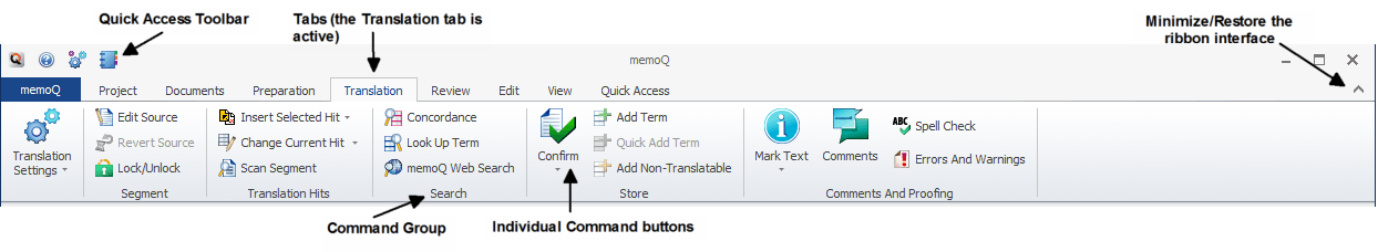
Mónika: The order of the ribbon tabs mimics a typical workflow – first you create/manipulate a Project, then do some work importing Documents, followed by Preparation of said documents for translation. Then you hand off your project for Translation and Review – during these phases linguists Edit a lot. Finally, you can influence memoQ’s appearance from the View tab.
We have also two special tabs: the tab called memoQ opens up the application menu, i.e. a surface where you can access commands that influence the behavior of memoQ in general (this is where you can activate, set options and access help, to name just a few). The other very special tab is called Quick Access – this one was designed with translators in mind, and gives them commands from other ribbon tabs that they are most likely to want to use during translation.
We have also many so-called context tabs, which appear only in a given context, like editing a TM or extracting terminology.
Q: I noticed that the Settings menu and few other panes kept their old design, which personally I find a little cluttered. Are there any plans to redesign them as well?
Mónika: We always have many more ideas than we have the resources to implement :). I personally would love to embed the settings fully in the application menu, but having seen that Options is a pop-up window even in Microsoft Word, I do wonder when we’ll finally get around to doing that.
Q: In my opinion, a good user experience must include some element of customizability. Unlike Microsoft Office’s ribbon, memoQ’s ribbon currently doesn’t offer any customizability options, and I think that for the very least the Quick Access toolbar should be customizable. Are there any plans to make the Quick Access toolbar user customizable?
Mónika: Definitely! In fact, we wanted to make the Quick Access toolbar customizable from the very start, but some technicalities I won’t go into prevented us doing this in time for the release. Stay tuned.
Q: Thank you for taking the time to answer these questions Mónika, it is much appreciated. Do you have anything you want to add?
Mónika: There is much more to memoQ 2014 R2 than the ribbon – we’ve revamped the TM editor, introduced a major usability improvement into segmentation rules, and translators can now even share TMs and TBs via Language Terminal with up to three people, which can be very useful for small, informal teams of translators. Go ahead, download, try and enjoy!
Summary
I witnessed a few transitions to the ribbon user experience and a reaction pattern has emerged: The announcement is followed by immediate skepticism, but as more users actually start using the ribbon user experience, the reaction gets increasingly positive.
Kilgray did a good job in implementing the ribbon and utilizing its inherit benefits, and therefore I’m convinced memoQ 2014 R2 will follow the same pattern. By now, I think the ribbon user experience has proven itself enough to generally become a non-issue, and even a preferred feature when implemented correctly.
It is reassuring to learn that the Quick Access toolbar will become customizable in the future, and while ideally I would prefer to be able to add an entirely new user customized tab to the ribbon, the Quick Access toolbar is a good start.
In memoQ 2014 R2 the ribbon might get most attention, but some important functionality foundations were laid for the future, and the usual further optimization to current features is present as well.
As always, this is a generally safe upgrade for those who like to be early adopters, but for those who prefer a more conservative approach it is advised to wait a few months before upgrading.
Footnote
* A little terminology anecdote: The term ribbon was traditionally used to refer to what is now being commonly known as the conventional toolbar-centric interface, whereas what we refer to as ribbon is actually called by Microsoft the Fluent User Interface (FUI), which I find to be a much more appropriate description of it. Back to the article
Leave a Reply